LETGROW
Mobile Remote / UI Design
OVERVIEW

LetGrow is a startup company out of Buffalo, NY. The product they designed is a hydroponic system that allows users to grow plants inside of their own homes. Many people all over the world don't live in climates that are suitable enough to grow veggies and other home plants. This soilless system is only 3ft x 3ft, taking up little space. The owners of the product hired me to design the UI for their mobile app. The app will allow users tmonitor and change system measurements from their mobile device.
DELIVERABLES
Research data to validate both business and user needs
Feature creation for a remote control
Sketches, Wireframes and a working prototype to explain design thinking
TIMELINE
6 Weeks
Nov 2017
|
ROLE
UI Designer | Graphic Designer | Research Analyst
TOOLS
Pen and Paper | Sketch | Invision | User Data
PROBLEM STATEMENT
The only way to control the LetGrow system is on the product itself. Is there a way to design an application that would allow a user to view and control the system while being physically away from the system itself?
MY PROCESS

DISCOVER
S.O.W.
The first thing I did was sit down with my client and draw up an S.O.W. I wanted to make sure I understood the requirements of the project correctly. The client had already conducted user research and created system features, so I played more of a graphic design role in this UX project. I had promised to have the project done within 6 weeks and deliver wireframes, accompanied by a clickable prototype. After my meeting, I had a firm grasp of the Business needs
BUSINESS NEEDS
During the initial sit-down with my client, I focused on discovering their biggest needs. I asked them what they wanted out of the app and what they would define as successful for the app. I was able to find three key needs the client had for the prototype:

An app that will allow all LetGrow system measurements to be displayed and tracked

A sign up process as well as a process to connect a system to your phone (via bluetooth)

A design that follows the visuals of the website (Give the sense of being outdoors)
CLIENT'S USER RESEARCH
What makes this project unique compared to previous ones is that my client came to me having already conducted UX research. Typically I am asked to execute my own user research and present it to my client. This client requested that I analyze current data with them. I met with my client a few times and went over data focusing on the users. There were many useful pieces of information I was given that would help me create personas and identify user needs. Three important demographic stats were:

Users aren't difinitive in age. The product attracts interest from people age 18+.

Lifestyle is more definitive than age. Majority of users are farmers or passionate fresh "foodies".

Users tend to love the outdoors and enjoy spending time in nature.
DEFINE
USER NEEDS
During the second meeting with my client, I focused on their knowledge of the user. The client had been conducting research for months so there was a lot I could learn from them about the user. I asked questions pertaining to demographics, pain points, and needs. After a few conversations with the client, I was able to create personas, an app map, and a project scope.

The majority of users requested a graph that would show a visual for previous measurements.

Users mentioned that they want sign-ups and navigation to be simple and seamless.

Users want measurements to be prominent and stand out (easily readable).
PERSONA
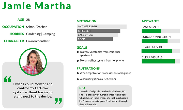
The client gave me one persona I could use to better understand the users of the LetGrow system. I took the user given and created my own in order to be more relevant to the mobile app. Below is the persona I designed:
1
2
APP MAP
After I found out both my client's and user's needs I started mapping out the necessary screens. I wanted to structure the main screens and draw out the paths/navigations. Three key screens include: Sign up/in, connect the device and read system information.

PROJECT SCOPE
Problem
The only way to control the LetGrow system is by standing next to the device itself.
Solution
I will design an app that allows users to control the LetGrow device from their phones. Based off of user and client needs, I will create a sign-up, an easy pairing process, and clear visual displays of measurements.
DESIGN
SKETCHES & IDEATION
 Sign In/Up | 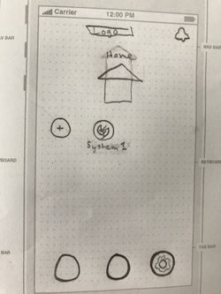 Home |
|---|---|
 Measurement Details |
Wireframes
FLOW 1: SIGN IN/UP


A
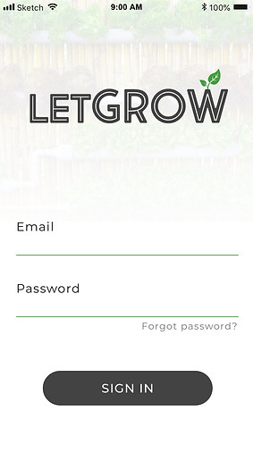
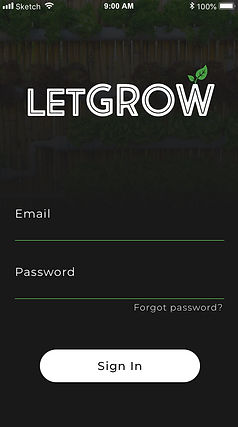
Foggy backgrounds with different visuals (helps keep the outdoor vibe).
B
Sign up is a simple one-page process. All that's necessary for an account is a name, email, and password.


C
Have italic examples inside of text fields. It helps keep required inputs unambiguous and clear.
FLOW 2: CONNECT A SYSTEM
A

B


C
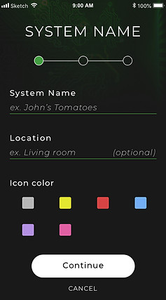
Give users a timeline of how long the process will take. Timelines are a modern tool that are very effective.
D
Found a way to keep bluetooth connection on one page. It is separated into three simple steps.
Many users with a lot of land mentioned an interest in multiple systems. This will differentiate them.
SCN Code is a placeholder name for now. The client is going to make codes that help validate system owners.
E
Button will search for devices without leaving the flow. It also wont have a "Finish" button until a valid bluetooth device is connected.
HOME SCREEN
I wanted to create a home screen that allowed users to add and view multiple all of the systems they have connected. I wanted it to be as minimal as possible in order to avoid users being overwhelmed

You will always be able to add a system from the homepage

The background gives "outdoor vibe" theme

System button will take you to the system measurement and control center

SYSTEM MEASUREMENT CENTER
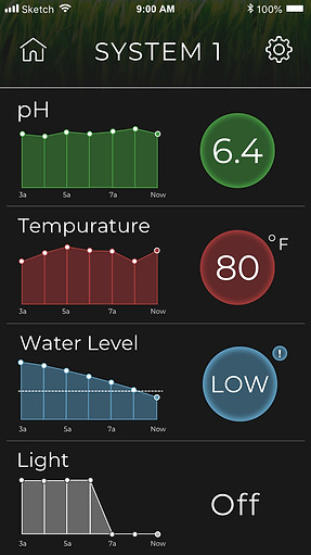
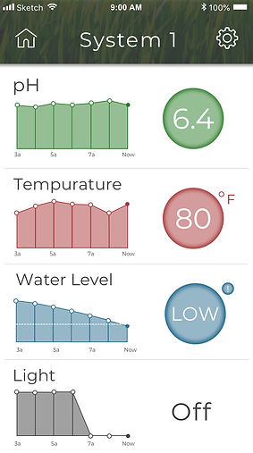
The measurement page is the homepage for the system. It displays all of the statuses that the system monitors. Each measurement has their own color so that users can recall which system is which easier.
Navigate back to the app homepage here
Graphs that show measurements for the past 2 hours
Big and vibrant text displaying current measurments

Clicking on a cell will take you to a detailed page for that specific measurement.

MEASUREMENT DETAILS PAGE
The measurement details page allows users to view multiple graph filters, a fullscreen graph, and notification settings. In some cases, measurements can be changed.
Go back to the system homepage here.
pH and light are adjustable. You can increase or decrease the values with easy to see buttons.
Notifications can be viewed here.
Switch graphs between the past hour, past week, and past 30 days.

OTHER KEY SCREENS

SIDE GRAPH (When the phone is turned sideways)
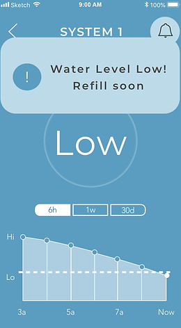
WATER LEVEL

NOTIFICATION
LIGHT ON
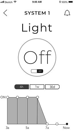
LIGHT OFF


TESTING
Once I finished the prototype I was ready to give it to my client. My client went through the prototype and approved it for user testing. They wanted to conduct the testing themselves, find out the most highlighted feedback and iterated backward from there.
After the first round of testing, my client and his team met with me and explained user satisfaction with navigation, ease of user, and visuals. However, the biggest finding was that about half the users had trouble visually with the black theme.
42%
58%
What to do?....

Because there was such an even split between users liking and not liking the black theme, I decided to keep it but also add a white theme as an option. It was as simple as duplicating each page and changing the backgrounds to white and the text to black. (excluding the colored measurement pages). The client is currently working on the settings page with developers, where the toggle between the themes will be located.
Check out the white/black theme examples below!
BLACK
WHITE