


OVERVIEW

The Wily Network is a non-profit established to improve college graduation outcomes for independent students at four-year residential college programs. They do this by establishing the Wily Network on college campuses in the Greater Boston area. The Wily Network provides intensive and extensive services in each student’s college community from donating materials to coaching.
PROBLEM STATEMENT
Is it possible to design a mobile app that gives users the right tools to make their experience in the program more efficient and pleasant?
TIMELINE
4 Weeks
ROLE
Mobile App Designer | Feature Creator |
User Tester
TOOLS
Invision | Sketch | Pen and Paper | User Data
DELIVERABLES
User research and personas to explain design decisions
Feature creation for a brand new company app
Sketches, Wireframes and a working prototype
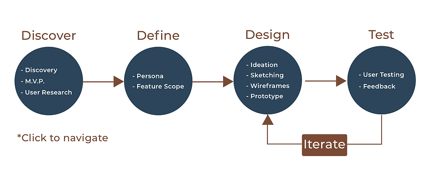
DISCOVERY
PROJECT DISCOVERY
During my last project with the organization, I noticed many users mention an interest in a mobile app. I didn't think anything of it until the end of the website redesign but there was enough chatter that I alerted my client. She agreed to send out emails to all 100 users in the program and get their yes or no feedback.
80%
of the users who replied said they would use a Wily Network app daily or weekly if they had one
BUSINESS NEEDS
I reported these findings to the president of the organization and she sat down with me and explained the organizations goals. Due to the timeline of the project, we agreed that a Minimum Viable Product would suffice for the initial design. The President of the organization expressed that
Our goal as a business is to give our users the most control and confidence that we can. A mobile app would be a good way to allow users to stay more organized and up to date with everything going on in the organization. To be a successful design, I want the features of the app to answer the most important user needs.
User Research
USER SURVEYS & INTERVIEWS
I wanted to create a survey to send out to the Wily Network email list like I did last project. I worded these surveys so that they cab be used as templates throughout the existence of the mobile app. Its the easiest tool to stay on top of possible updates and improvements necessary for the users. I created a short, 5 question survey that helped me find out if enough of my users had smartphones and their opinions on the mobile app.

KEY FINDINGS

Most users had cellphones and use them daily. Most donors are affluent tech-savvy people and scholars get one when enrolled into the program.

The responses I received for feature suggestions were very different between donors and scholars. Scholars had a wider variety of answers compared to donors.
About 70% of users tested said they prefer a bottom tab nav bar over all others.
AFFINITY MAPPING

For this exercise I only included the scholars. The reason for not distributing the affinity mapping exercise to donors is because the responses to feature suggestions was so few and indifferent among all of those I interviewed early on. It wasn't necessary to explore features in more detail like it was for scholars. I recorded the most popular app features scholars requested during surveys and interviews. I then sent 10 students an email with a ranker list of 10 most common features expressed earlier. The mapping exercise was simple, I just asked them to rank the features from most to least important in their opinion. I ended up using the data help me pick the minimum viable features for this first prototype.
KEY FINDINGS

DEFINE
PERSONAS
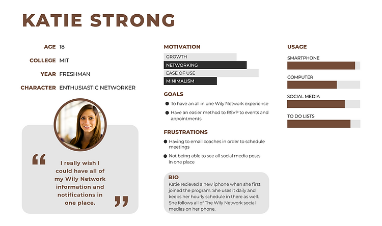
SCHOLAR
DONOR
FEATURE SCOPE
SCHOLARS
News Feed - Being able to see all Wily Network posts and events in one feed (filters included)
1.)
2.)
Schedule - View Wily events you RSVP to as well as the coaching appointments you make.
3.)
Tips - A place where scholars can read about advice and tips on different topics relevant to college students
DONORS
News Feed - Being able to see all Wily Network posts and events in one feed (filters included)
1.)
2.)
Donor Tracker - Donors can view all past donations and make one time donations as well
DESIGN
SKETCHING & IDEATION
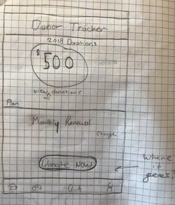 Donor Tracker |  Donor Tracker 2 |  My Schedule |
|---|---|---|
 Donate Now |
FIRST FEATURE: SIGN UP
The first thing I wanted to create was a simple sign in/sign up page. If a user has already signed up, then its a simple email and password to log in. But for first timers, I had to design a screen for creating an account.
STEP 1: LANDING
STEP 2: DEFINE USER
STEP 3: VALIDATE USER


SCHOLAR FEATURE 1: NEWS FEED
The news feed was the most popular feature so I felt it would be an appropriate home page for scholars. Some key things to point out are:

Scholars can filter between social platforms

Scholars can search for keywords

Scholars can seamlessly navigate between features


SCHOLAR FEATURE 2: MY SCHEDULE
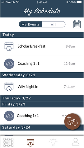
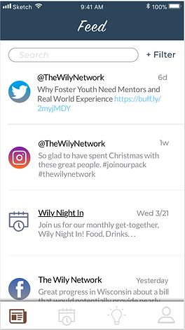
The 'my schedule' feature made the top 3 in 9/10 scholar surveys. I wanted to design one screen where all events and appointments can be managed and responded to.
Scholars can view upcoming events and coaching sessions
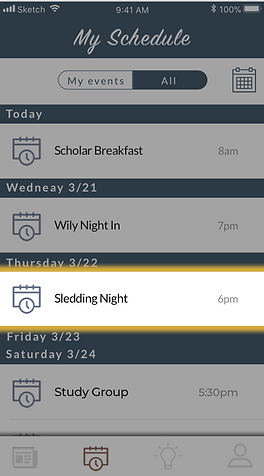
Toggle between your confirmed events and all upcoming organizational events
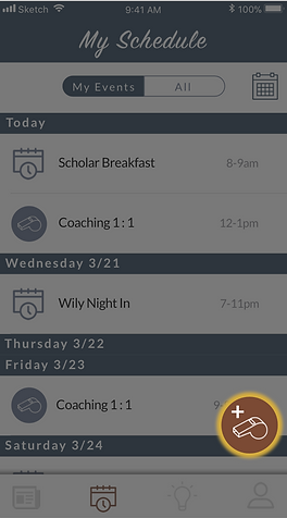
Sign up for coaching time slots and events in the three easy steps displayed below
STEP 1: CLICK WHISTLE
STEP 2: SUBMIT REQUEST
STEP 3: CONFIRMATION


STEP 1: SELECT EVENT
STEP 2: VIEW DETAILS
STEP 3: CONFIRMATION


SCHOLAR FEATURE 3: TIPS
Originally I had wanted only two features for both sets of users. A tips and tab showed up in the top 3 in 8 /10 scholar surveys so I felt it was important enough to include a simple UI for now.
Tips on cooking and eating on a budget
Help with laundry and cleaning advice
Business and social tips for networking

Shortcuts for smartphones, computers and commonly used software


DONOR FEATURE 1: NEWS FEED
Like the scholars, donors expressed a similar interest in a news feed of some kind. For a MVP two features were fine enough to . There is only two noticeable differences between the scholar and donor home pages:
Replace events with inspiring videos and aritcles
There are only two features on the donor prototype because of MVP and donors showing less variety of feature desires than scholars had.

DONOR FEATURE 2: DONOR TRACKER
This was a popular idea thrown out during user surveys. Donors wished they had a place they could donate, manage their reoccurring donations and track all recent donations in simple steps.
View year to date and previous year donations
View and change reoccurring donation plan
Make one time donations

Prototype 1.0
Try It Out Here!

Try It Out Here!
TESTING
NARRATION
After completing the prototype I wanted to test as quickly as possible. I tested 3 qualified users (2 scholars and 1 Donor) to get feedback on my design. I gave them each a task and had them narrate their journey. All three completed the task, but had a few critiques noted below.
SCHOLAR 1
"The sign up process is simple and unambiguous"
"The X and check mark in the event page doesn't pop out, I wish it did."
SCHOLAR 2
"Not too much clutter, its simple"
"I have to think too much when landing on a new screen for the first time"
"I didnt click the whistle because I didnt know what it would do"
DONOR 1
"I love the news feed, its easy to work"
"I wish there was a way to view all contact info for the organization; in case I have any questions"
V. ITERATIONS
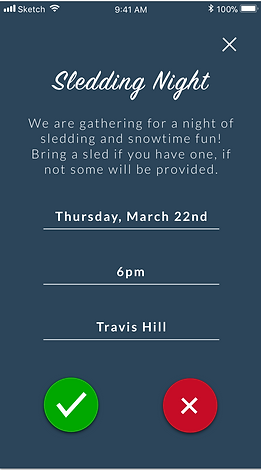
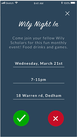
1. EVENT RSVP BUTTONS
Iteration- Brightened the color of the buttons as well as gave them shadows
BEFORE
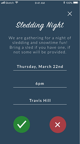
"The X and check mark in the event page doesn't pop out, I wish it did."
AFTER
2. ON-BOARDING
BEFORE

"I didnt click the whistle because I didnt know what it would do"
AFTER

BEFORE
AFTER

BEFORE
AFTER
