


OVERVIEW

To improve college graduation outcomes for independent students at four-year residential college programs by establishing the Wily Network on college campuses in the Greater Boston area. The Wily Network provides intensive and extensive services in each student’s college community.
TIMELINE
4 weeks
ROLE
Design Consultant | Information Architect
TOOLS
Axure | Sketch | Pen | Paper
DELIVERABLES
Carried out intensive user testing to create personas & identify pain points.
Restructured the Information Architecture, moving content more than changing it.
Created a working prototype based on my findings.
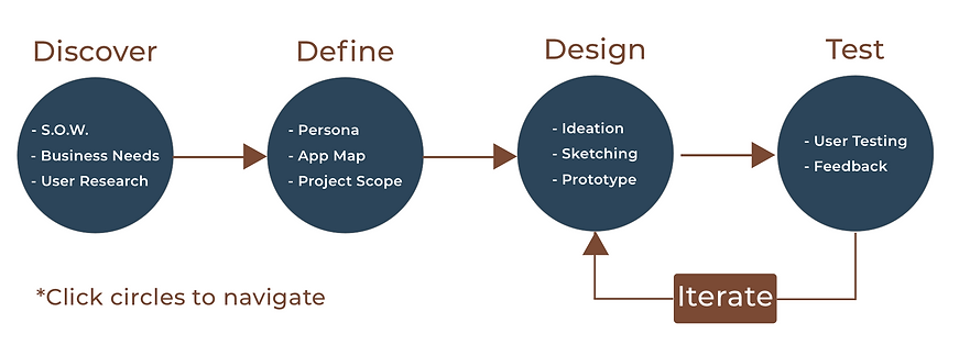
DISCOVER
STATEMENT OF WORK
The first thing I wanted to do was sit down and have coffee with the president of the organization. I wanted to find out what they were looking to gain from my consulting & any constraints I would run into through my process. The client was looking for a more IA focus, leaving the logo, color scheme and text the same. I was able to discover my constraints and the business needs.
BUSINESS NEEDS
1. User Data - Online Surveys, Testing, Personas
2. Reorganize content on each page, tightening up the hierarchy
3. Create a working prototype to display my ideas

CONSTRAINTS
-
Don't change any of the wording, just content positioning.
-
Keep every image currently on the site but place them in more appropriate places
-
Only wants user testing of the site and my prototype.
User Research
ONLINE SURVEYS
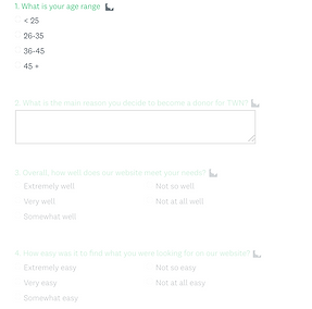
The first thing I wanted to do was to create surveys that would be sent out to people subscribed to the organizations newsletter. I wanted to get general feedback from both scholars and donors who us the site. These surveys are for future design changes. The president wanted to gain a lot of feedback so they're taking their time collecting it. The two surveys didn't take long to make due to the fact that the responses needed are about site function and pain points.
DONOR SURVEY
SCHOLAR SURVEY

CONTEXTUAL ANALYSIS
I was able to meet with 4 scholars and 4 donors who have been a part of the organizations program for several years. I wanted to watch them use the Wily Network website and see what likes and pain points they had about the current site. My 3 major findings of contextual analysis were:
1. THE FIRST FOLD
Out of the 10 users, 8 tried to click on the images on the first fold of the home page. They assumed they were links to other pages. I felt that to be important because the landing page should be as unambiguous as possible.

3. UNAPPEALING VISUALS
7 of the 10 users made note of some of the visuals on the site, saying they seemed sloppy. They also mentioned the fact that there weren't many images of the students, staff and the entire Wily environment. I assumed that credibility of the organization was reflected by the attention to its site visuals.

2. TOO MUCH NAVIGATION
More than half of the users commented on the fact that most of the tabs lead to a single page with a paragraph. They didn't like that they had to click a lot of times. This made me believe that there were too many navigation tabs and things could be consolidated.

DEFINE
PERSONAS
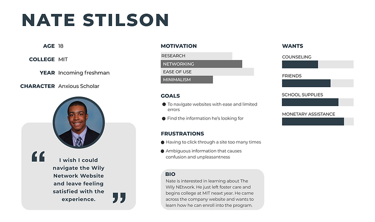
I took a small amount of time outside of the project to create two personas. The president stated that they had a lot of user research but didn't have visual templates for describing each user. I believed it was important for a startup to have to have personas because employees come and go, so having a template for people to easily understand target users would be helpful.
SCHOLAR
DONOR
APP MAP
It became evident during user analysis that organization of site content was the most notable flaw. There were too many tabs for too little of information, so I felt that consolidating relevant pages was the best solution. I started by mapping out the current site.

DESIGN SCOPE
PROBLEM
SOLUTION
Thewilynetwork.org has too many pages for the amount of content per page. Users find it tedious to click from topic to topic, skimming the nav bar. The lack of visual aesthetics adds to the uneasy feeling of the site as well. Users are displeased when there is all text and no images. Lastly, pages lack structure and even spacing, giving a messy look.
Redesign thewilynetwork.org keeping three things in mind:
1. Minimize navigation/pages
2. Restructure each pages IA
3. Modernize the visuals of the site
DESIGN
MINIMIZING NAVIGATION
I screenshot every page on the clients site and saved all of them as images. I did a digital card sorting where I had users help me group similar content, using the screenshots as visuals. Below is an example of three different pages that were very similar in topic. Users agree that pages like this should be combined into one. The pages alone are very light on content and require extra clicking overall because they do not utilize consolidation of similar pages.
 Page 1 |  Page 2 |  Page 3 |
|---|
AFFINITY MAPPING
I took the newly created groups and wrapped them in separate boxes. Users helped me name the groups based off of the common theme the content shared. These became the new and minimized pages for the site. I built a site map to simplify the many affinity diagrams created.
AFFINITY DIAGRAMING

SITE MAP


IA WIly
Next, I took the screenshots of each page on sketch and began stacking them based on hierarchy provided by users. It wasn't as easy as it looked, the client didn't wish to have any content changed so I had to find ways to make existing sections fit into their new pages. I did this by making sure I had enough new and existing images to wrap around the unchanged text.
INFORMATION ARCHITECTURE
MODERNIZING VISUALS
There were two visuals on the website that were over 80% of the users noticed during testing. The first was the homepage carousel. Many users clicked on it and noted that they assumed it was a link to a page. I kept the carousel and just added navigation items to each image. It utilized a lot more of the first fold as well.
HOMEPAGE PROMOTIONAL IMAGE

ORIGIONAL

EDITED
Wireframes
FIXING MESSY IA

