


BIG4BOUND
Complete Website Redesign
OVERVIEW
B4B
Big4Bound is a downloadable pdf/help guide that prepares young professionals for getting a job in one of the big 4 accounting firms and to navigating the recruiting process. This complete insider’s guide is sold online and is downloaded to PDF format. The rest of the website explains the product and the company. There is also a section for news and articles written by the two founders.
DELIVERABLES
Carried out intensive user research to create a hi-fidelity persona.
Restructured the Information Architecture, moving content more than changing it.
Redesigned the entire site from top to bottom, keeping personas in mind.
TIMELINE
3 weeks
ROLE
Design Consultant | User researcher | Information Architect
TOOLS
Axure RP | Google Analytics | Crazy Egg
Whiteboard | Survey Monkey | Pencil
PROBLEM STATEMENT
Big4Bound.com has all of the information a young accountant needs to help them get a job in one of the big 4 accounting firms. How could a redesign of the site based off stronger ux research benefit site traffic and increase user purchases?

I. DISCOVERY
BUSINESS NEEDS
I sat down with my client and casually went over what his needs and goals were for this consultation. He explained that he wanted a complete redesign top to bottom. There were three things my client explained as the goals of the project:
Our goal as a business is to have our users navigate our website with more conversions on sales. I believe that our data we collect is not organized or analyzed enough. To be a successful design, I want the new site to improve SEO, information architecture and site traffic to the blueprint page or toolkit. Visualizing this in a prototype would have best impact.
Research
User research was crucial if I were to accurately solve my clients needs. The three tools I used to gather enough information were Google Analytics, Crazy Egg and user interviews. My client sold the book as a pdf in order to keep the ecommerce in autopilot mode. This guide was just a side thing for him so the site design had to direct visitor traffic without compromising the hands free product management. The different tools I utilized to conduct research were:
GOOGLE ANALYTICS
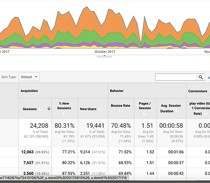
AGE
I discovered that 50% of site visitors were under 25 years old. Getting into the Big 4 requires a high-level college degree so, with those two findings I was able to conclude that college-aged kids were the target demographic for this product.
SITE TRAFFIC
Need to divert traffic away from articles page before visitors exit the website.
TARGET DEMOGRAPHIC
-
Age=18-24
-
College students interested most
-
gender-neutral color scheme
CRAZY EGG
Crazy Egg is a web analyzer tool that will record clicks and scrolls of visitors of your site which helps measure information architecture of that page. The two pages our client provided for us with were the homepage and the blogs main page.
HOME PAGE
With only 38% of page visitors scrolling this low, the video isn't being utilized as much as possible.
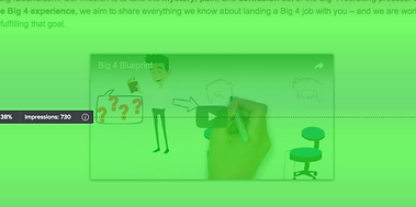
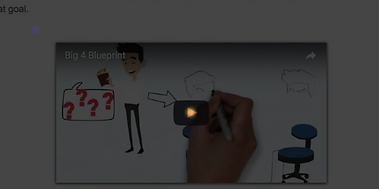
Located all the way at the bottom of the homepage, the product information video was the most clicked item on the page behind the blogs tab.
USER INTERVIEWS
I was able to interview over 10 professional accountants whom I knew or met through people in my network. They ranged from 24 to 33 years old and also ranged from having no experience of being in the field for 5+ years. I asked them questions from their time as a student in an accounting major. I was also able to test 5 current accounting students at Boston University. They agreed to contextual analysis, allowing me to interview them while they explored big4bound.com. My key findings are as follows:
INTERVIEW QUOTES
“It is easier to get a job at a big four firm as a new graduate for an entry-level position.” - Jen 33
“I wish I bought an interview guide when I was in college" - Evan 24
“I think a website's visuals should look credible to a young accountant or else they wont trust your product ." - Ann 31
CONTEXTUAL ANALYSIS
-
No users knew that the product was a PDF (wasn't described as one)
-
Only one person came across the product video while navigating the site.
-
The about me section made users distrusted in the product (no detail)
II. DEFINE
PERSONA
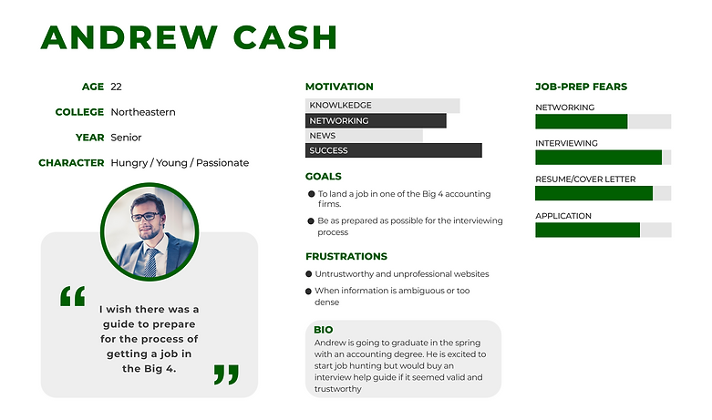
After my research was complete, I was able to create a high-fidelity persona. The persona Andrew encompasses the most accurate demographic of my client's target user. The client only requested one persona for the first sprint of this project so there was no need to make any more for now.
DESIGN SCOPE
PROBLEM
-
Inaccurate Hierarchy.
-
Too much fluff
-
The site is not minimal and at the same time has terrible navigation
-
Blog page is main portal
SOLUTION
I will rearrange the relevant content for a better information hierarchy, removing unnecessary content in the process. I will also improve site traffic, transitioning visitors away from the blog pages onto the product description page
IV. DESIGN
AFFINITY DIAGRAM
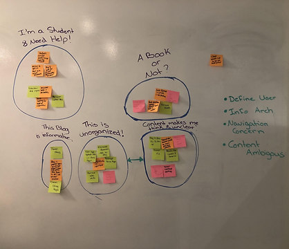
I took all the key findings I had from user research and mapped them out in post-it notes on the wall. I had grouped similar notes together and gave each group the name of a problem they represent on the site. The 4 major focuses of the redesign were:
-
Design for the user (new color scheme)
-
Fix site Information Architecture
-
Give site more navigation options
-
Fix ambiguous language
TYPEFACE & COLOR SCHEME
Before I decided to digitize my sketches, I wanted to pick a font and color scheme as well. I read an article on crazyegg.com that showed color schemes that worked well with accounting websites. I got the inspiration for my color scheme from 2 different pallets in the article. I used the light green and slate grey colors and white as a neutral.

f27b35
272727

03a63c
3e688c
69bf6f
5ba66e
SKETCH SPRINTS
I created my own exercise in order to ideate what the new screens would look like. I ran myself through different 15-minute sketching sprints with 5 minute intervals within it. I sketched the same screen 3 times each taking 5 minutes. I was able to come up with different visuals and combine what i liked from all 3 sketches.
 Our Story |  First fold | 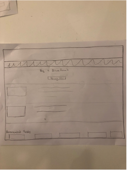 Second fold |
|---|---|---|
 Articles page |
I turned my favorite sketches into whiteboard drawings, gaining feedback and iterating quickly as well as frequently.
 Outline | 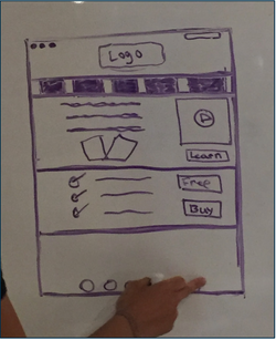 Homepage | 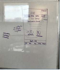 About Us |
|---|---|---|
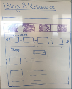 Articles page |
Wireframes
H1'S

